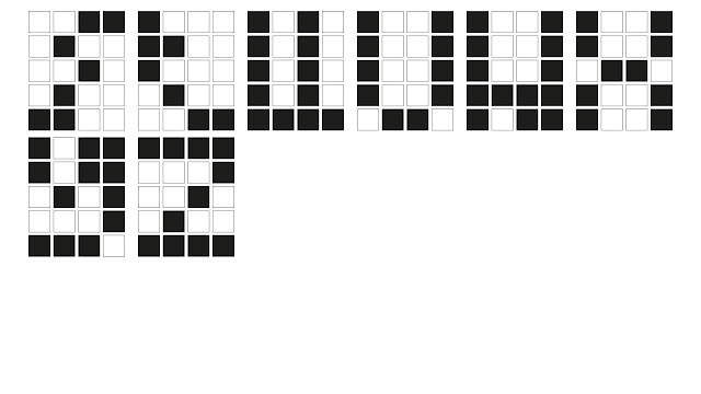
Thursday, 21 April 2016

Message And Meaning

This lecture about message and meaning was to help understand what complications occur when communicating a message and how it maybe perceived by others. The sound of this lecture produced a common intrigue with myself and other students, as we are upcoming designers, and knowing more information about this would be very beneficial to our studies.

"The Difference between poetry and practical messages is that the latter are successfully only when we correctly infer the intention" Michael Rock

Message and meaning at base value seem like common knowlage and understanding, however when it comes to designing it is crucial that designers consider all the possibilities of reactions that can come from that piece of work. If not this can lead to miscommunication and can invoke a hugely negative or controversial responses from an positive intended product. This in my opinion has got much worse with the introduction of social media where opinions can gain influence with popularity and can completely generate a meaning from something which isn't present. This happens through standard communication through social interaction through digital means such as texting, where others can become offended though poor expression. With this in consideration I began to understand the pressure designs have constantly in the industry. 

Due to the fear of negative outcomes, it was expressed during the lecture that graphic designers and animators should constantly keep reviewing the message which can be interpreted no matter how small it could be.

What is Message?


"A short communication transmitted by words, signals or other means from one person, station or group to another."

What is Meaning?


"Meaning is what the source or sender expresses, communicates , or conveys in their message to the observer or receiver, and what the receiver infers from the current context."

We was shown an image of the process and how the communication transfers from the designer to the audience. This seemed to be an infinite process as perfection of message and communication seems rather unlikely in a consistently developing world, where morals, opinions and understandings change. 


Send/Encode: Represents the information translated into a message in the form of ideas or concepts.

Channel/Medium: Represents the Process in which the sender uses to communicate the message

Receive/Decode: Represents the way information is received through the channel.


Convergence Lecture

As part of my sense of place project the word 'convergence' is the key topic which myself and fellow students are basing our research and designs around for the Concertina Sketchbook. The purpose of this lecture was to further my understanding of the word convergence and how that it applies to my study of design. My current understanding at the time of this lecture was that convergence and how it applied to design, was a cross combination of separate ideas forming  together generating a new concept.

"Convergence is an ambiguous term used by various disciplines to describe and analyse processes of change towards uniformity or union. Its application in the communications sector often referred to as media convergence also encompasses valuable approaches and insights to describe, characteristics and understand the digital creative economy" - Media Convergence Michael Latzer / Quote from the lecture slideshow.

Uniformity definition: Google Definition

1 A state or condition in which everything is regular, homogeneous or unvarying.

2 Lack of diversity or variation, especially to the point of boredom or monotony; sameness.

Union definition: Google Definition

1 The action of joining together or the fact of being joined together, especially in political context.

2 A society or association formed by the people with a common intreat or purpose.

However from the first few slides of the presentation I knew that the word convergence would be something that was of huge importance to the theory of design, as design is a subjective practice and is heavily debated, the topic of convergence would be an interesting idea to explore.

Other Words For Converge:

Multidiscipline - Interdiscipline - Crossdiscipline - Synergy - Intergrated - Hybrid

The lecture consisted of a set of opening quotations of opinions on the overall idea of how convergence applies to design. Following the quotations our lector additionally showed designs of varying styles and medias. For instance I personally liked the exploration of logo designs, keeping in mind the word convergence, I saw the designs in a completely new perspective.


Screenshot taken of the logo's shown within the lecture

For example the Kleenex logo at first glance appears like a standard font based logo, however with the word convergence in mind, I started to see the relation to the word through the way in which the letters were conjoined. This small aspect proved to me that convergence isn't just about overlaying different design practices and experimenting with gradients. It made a statement to myself that it is more about the subtleness of design, understanding the sometime less is more.

Wednesday, 20 April 2016

Practical Drawing: Typography Week 3

The task this week was to produce a finalised version of my chosen typeface. I decided that I wanted to proceed with the creation version of my 5 by 4 square grid typeface. This typeface would also be an experiment which I would include in my EU referendum engagement project.

Finished Alphabet Layout Of Chosen Type


Illustrator Converted Type Vector Design


To better apply my typeface in a more digital way, I decided that I would create a vector based version of my physically created type. With the ability to create cleaner lines and colour I created each type out of a 4 by 5 group of boxes. These boxes would have the letter filled with a black box, while any negative would be a white box, with a slight stoke around the edge. This helped myself visualise the idea digitally. I also thought that this allowed the type to keep to a constant formation when being used to display words.

I think that these typography workshops have been very beneficial to my development as a graphic design, I now think much differently about how type is generated and  have gained valuable experience in the construction of my own typeface. With these skills developed I can hopefully explore a typeface generation project in the future.

Practical Drawing: Typography Week 2

This was the second task of my process and production lesson, the purpose of this task was to construct 3 complete alphabets forms. I have completed three styles of alphabets, each using a particular method of producing a particular shape. However all of these typefaces are being constructed under the theme of compression.

This alphabet is focusing on using shapes to cut out of a square block to produce a an identifiable letter form. This alphabet is mostly using triangles to form negative space for the shapes. This is a really nice and unique looking typeface, however for letters like the G, O and P the letters a much harder to read, this is an obvious complication as a good typeface can be read easily.

Square Box Cutout Typeface


I personally really like the way in-which this typeface formed, giving the impression of digitalisation and almost like a retro themed design. This type of design had a unique form of structure due myself limiting the area of space which I could work with. During the creation of this typeface, I understood how good typefaces require good transition from one letter to another, as it this makes the typeface much easier to read in a sentence or when words are constructed.

5 by 4 Square Limited Ratio Typeface


This typeface focused on compressing the size of letters. Making them look much thinner and removing any curves. This would give the type a particular shape edged look. I also thought about completely filling the lines but I thought that the the way in-which you see the construvtive shapes and lines added to the overall character of the typeface.

Reduced Letter Size Typeface


Overall I am very happy with my three created alphabet typefaces, I will also look forward to producing one of these typefaces further seeing how I can improve and refine the overall design. 

Practical Drawing: Typography Week 1

This weeks practical drawing process and production session focused on the generation of physically produced typography. We was told that this would span across the rest of out process and production workshops, focusing on a different task each week. This week my task was to transcribe shapes into letter forms, either upper or lower case. I began by joining shapes together using a curved edge and in separate parts, this was so that I could understand the construction of the shape, knowing where each part of the text formed. The letter this created was a J and looked somewhat mechanical, like the binding bridge between the wheels on a old steam train. With this in mind I created a few other shapes that used the same process.

I then wanted to explore using simple geometric shapes to explore how together they could create a letter. At this point I wasn't to bother about lower and upper case letter, my main priority was to understand how letter forms constructed. I used a group of circles to produce the letter I. However, I didn't think that these circles should join as this would be to predicable. However this created the complication that the letter I would look much different that its intended form. I decided that to help produce the idea of the letter eye, I would then with the traditional head of a lowercase eye, add some other circles to resemble a pupil and iris, giving a more visual representative of the letter eye. This can also be seen with Dingbat letter forms. 


An Example Of Dingbat Letter Forms


I then looked at producing a few more compressed letter form, forming shapes within a boundary or touching each other. For example the letter S would commonly be much taller on a standard font, however I shortened this letter by removing unnecessary parts of the letter, but retaining its iconic state. I understood that this was a very relevant factor to creating a good typeface.


I then began to produce an alphabet series based on my compressed typeface idea. I decided that I would go with a restriction 5 by 4 squares, to fit with the theme. Overall I am very happy with the outcome of this typeface as it gives a really nice introduction to this process and production typography series.