This Creative Cloud session we looked into generating layouts and refining our skills across a 2 page spread in the adobe program indesign. We were asked to select an image of our choice for the excise and I decided that I wanted to use an image of something I was really interested in. Due to the recent release of the game Fallout 4 I decided to choose an concept art image of the Brotherhood of Steel armour. With this image we were shown ways of altering the its appearance, this was done by utilising both photoshop and in-design together converting the image to a bitmap. When the photograph had been converted a number of effects could be applied to the image creating different visual effects.
Monochrome Textured Effect
RGB Colour Effect
Monochrome Effect
CMYK Colour Effect
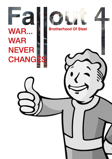
We then looked at composition and text editing. This involved placing an image into the title, in this case the fallout 4 title, using the same image I had previously bitmap edited. This title had also certain letter elongated in illustrator giving a unique impression to the page. For good measure I added the pip-boy mascot for the fallout games onto the page.
Afterwards I used the same pip-boy mascot and place him into a bulk place holder writing text. However by clicking the image surrounded by text icon at the top of the program, this enabled the icon to influence the text placement. I place him many times to see the overall effect this button had on the page. I am not a fan of this feature as I like to have my layouts clean and divined.
While focusing on text placement we was show the how to make text follow a particular path, this was done by firstly creating a path pattern using the pen tool and increasing the stork of the line. I then inserted text on the line, creating its path. I thought that this was a useful tool in creating unique page layouts, adding some creative flare to a magazine page.
To better understand composition we was show how to add rulers and grid guides, it was said that it is best to divide a page by using 12 likes, this is because it has the a good amount of divisible lines allowing for almost any paragraph with. We then created three paragraph each at three bars wide and make each paragraph varied lengths.This was show to us so that we could understand how to make standard text look more appealing, within a layout.
The final thing I was shown was how to use layer effects in indesign, this feature is also in photoshop but I didn't know how to apply this with this program. This was accessed through by opening the effects window and using the drop down menu to create certain layer effects over a background image. This image was created by creating an orange back and applying the multiply effect on top of it.
Overall this this was a very enlightening tutorial as I now understood how to make images look more creative in indesign rather than needing to depend on photoshop to do simple tasks. Increasing my potential production speed during projects.


