Showing posts with label Motion Graphic. Show all posts

Thursday, 21 April 2016

Motion Graphics: Season Finale "Fish"

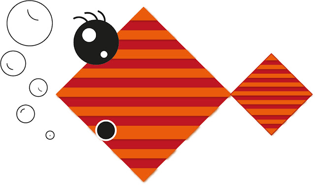
This was my final motion graphic process and production session with Sara. My final task was to produce a 10 second animation of a sea creature, this would then be put together with the rest of the groups material as a collaborative showreel, showing off our work together. I decided that I would create a fish swimming in the ocean.

However I decided that the design of my fish would be rather graphic and geometric, having a different aesthetic to other sea creatures other people in the group would make. This allowed my design to be simple, and would allow my fish to make slightly exaggerated movements. When designing the fish I wanted many features to be animated. such as the tail, eyes, mouth and bubbles, which would give the fish a more character. However, I needed to keep in mind that for myself to animate these areas I needed to put them on individual layers.


Once I was happy with the completion of my fish, I began animating him in after effects, creating all the movements. This process was quite easy and allowed myself to really take my time to polish the movements so that they did not look jumpy.


Fish Animated from Jordan Harnett on Vimeo.

Once I had created all the static individual movements for my fish, I then needed to create a movement pattern to span 10 seconds in length. I thought that by giving my character a detailed movement, I could express his personally though, by making him quite shy. The idea was have the fish move quickly from one side of the screen to another, having him pop out occasionally in the cameras view. To achieve this I also wanted to make the fish smaller and larger throughout the movement animation so that it would play with perspective and insinuate that the fish was moving closer and further away. With all these technical composition ideas into place I would hope that my fish displayed quite a frightened emotion and seem quite shy.


Fish Movement from Jordan Harnett on Vimeo.

After this we then exported our fish to Sara where she combined everyones fish in to a little show reel. To my surprise this worked really well, because I thought that they would be many inconstancies in everyones skill level, but this worked out to have a rustic charm to it.

Overall I am very happy with the outcome of my final fish finale, I think that the fish was of good quality, however looking back I do think that they could have been some aspects which could have been better, such as the background and the possibility of adding some sound effects and background music.
Monday, 22 February 2016

Motion Graphics: Character Animating

Character Creation #1 from Jordan Harnett on Vimeo.


For this motion graphics studio, the group was asked to design and create a character in adobe illustrator, which would then be placed into adobe after effects to be animated. In order to make the particular parts of the character to move, I needed to create each part of the character on separate layers so that when imported it transferred the layer information into after effect, so that the character would animate correctly. I wanted to create a minimal design for a character, so that I could focus on transferring an expression in correlation to motion. What inspired this design was the concept of Disney's Inside Out characters, using colour and focusing on a select emotion. In this case my character was to display bordem through the use if a blank expression and rather frustrated eyebrow and mouth placement. I think that this resembled the concept of boredem.


Once the static character had been created, I needed to understand how motion could better express this, so I decided to have the character dancing slowly while moving his eyes, this expressed the my character was uninterested in taking part of the dance. Overall I am very happy with the outcome of my character.

Motion Graphics: Kinetic Typography Part 2

The task for this motion graphics workshop was to produce text in a 3D space, in adobe after effects as this was the second part to our kinetic typography theme. We first had to choose a some text to be within the 3D space. For example, a quote, phases or song lyrics. I decided that I would choose the lyrics from a song called Kings And Queens by 30 Seconds to mars. These words would give me the foundation for how the 10 seconds animation would be set out.

I began by laying out the the composition of the text, arranging each word onto layers in illustrator, this would allow me to move each word thought the 3D space. With this complete I then place the text into After Effects, clicking on the 3D icon so that they would be reconized as a 3D object. This was done for when I introduce lighting and the 3D camera tool, making the text look much more realistic. Changing the current camera view to the full perspective I then moved each text closer and further away so that when I implicated the camera zoom, each text would move closer to the camera at different speeds, producing cool 3D visuals.

I then moved onto creating the lighting and shadows, this was done through the placement of two lighting emitters, to capture the atmospheric lighting that I wanted. However to be able for shadows to for, both the text and the lighting needed to have certain boxes ticked.

It was at this point that I wanted to create two different version of my 3D kinetic typography. One version would include sound and text and the other would have a minimalistic design, using only two colours and lighting. The minimalistic design would resemble the bands colours.

I took into consideration that I would be unable to use the copywriter material of 30 seconds to mars song King and Queens, so I opted for some royalty free music from bensound.com. This music using an acoustic guitar, drove the purpose for the inclusion of text ad for the animation to be slower than the minimalistic one.

I personally like the texture and sound kinetic typography better, as it creates a soothing aura, more enhanced by the worm orange lighting.

Kings And Queens Texture And Sound from Jordan Harnett on Vimeo.

Kings And Queens Minimalistic Version from Jordan Harnett on Vimeo.

Overall I found this motion graphics lesson very beneficial, as I now one more about the 3D workspace within After Effects, which in future could allow myself to create some really nice music videos, with kinetic typography visuals.

Sunday, 7 February 2016

Motion Graphics: Kinetic Typography Part 1

For this motion graphic workshop we was asked to produce a 10 second kinetic typography video and upload it to my Vimeo account. Firstly we began by mocking up our design in adobe illustrator where we could produce the overall layout of text, and generate a short storyboard for key time frames in the animation. This was created using the same document size as the after effect animation so that when I exported my assets across the separate softwares, there was no sizing problems.

Here is my storyboard which I created in illustrator, overall I am rather happy with the result. The idea behind this style was to be clean and minimalistic, following a short story. I picked helvetica as my font because it is a very common font among designers and I would use this as my basis for the story.


Arrows shot across the screen and text appears in place.


Arrows carry on moving right and text appears on screen. Dots gradually produce a line.


Text moves in from the right. Arrow slowly jumps to each font style. Black line comes from bottom revealing white text.


Black line moves further up and text goes white.


Arrow moves across screen and comes back, Text forms into place.


Fade to white. Smilely Face Emerges.


During the creation of my animation we was also asked to provide some music as a backing track for the kinetic typography, we had to only use royalty free music so that I didn't breach copyright laws.

Unfortunately I extended over my time limit and couldn't fit everything from the storyboard for the session, however in future I hope to extend this kinetic typography animation so that I can see how the animation would look in a complete form.

Here is my 10 second animation.

 
Helvetica Kinetic Typography "10 Seconds" from Jordan Harnett on Vimeo.

Friday, 30 October 2015

Motion Graphics: Theory Of Everything


Theory Of Everything from Jordan Harnett on Vimeo.

Link - https://vimeo.com/144020114

Here is my first attempt at motion graphics for my process and production module. In this lesson I learn how to import text, audio, solids and transitions into the software After Effects. The purpose of this motion graphic project was to produce a short 10 second clip as a trailer in response to a book of my choice. I had chosen to pick the Theory Of Everything by Stephen Hawing with the intention of creating a graphic and unique stylised aesthetic, taking inspiration from the grunge style by David Carson.

As a requirement I was asked to create 10 images which would be used within the motion graphic video, I originally was going to produce my video using HD space images I found on a online digital wallpaper website, due to inaccessibility to be able to capture my own primary sources,  however as I was unable to prove that I was legally allowed to publish using these images so I needed to find another source. I eventually came up with the idea to look at NASA's photo gallery as I heard that these photographs were legally allowed to be published for projects, allowing me to avoid any copy-write infringement. In addition I also needed to search for royalty free music, which I found on a website called Bensound.com which only asked to be credited for the music if used.

I then began to edit the photographs in photoshop by using the threshold and blending tools to create a grungy block black image, which had a transparent background so that when it came for the background to change colours, it did so in correlation to the overlaying image.

Overall I am satisfied with the outcome although I feel that I could change aspects of the motion graphic, adding more motion rather than having changing slides. The Effects which added subtle movements to make the static image move slightly, would have added a sense of depth to the overall video.

Sunday, 18 October 2015

Motion Graphics: Jelly Bean "Life"

Using Only Jelly Beans, This Video Will Convince You To Live Life To The Fullest
Posted by SOML on Friday, 27 February 2015
This particular motion graphic video really inspired myself as an artist, it really opened up to a range of ideas on concepts that even the most simple of objects can be used effectively if the message is strong enough. The way in which a simple jelly bean can represent a day adds much more emphasis on how short lived we are, and how we should attempt to live life better. The main reason for this powerful reaction is because of the visual element of the single jelly bean, when you can visualise an entire life in a simple frame it appears to amplify emotions significantly. Without the commentary however we would find it difficult to understand the true purpose and this is where I feel that more could have been done with the jelly beans in general, perhaps having a range of ways to remove them, perhaps using a leaf blower to project them aways with swift motion occasionally would have broken up the repetitive action of removing the jelly beans.


Screenshot Of The Video


Even within its current state I believe that the purpose of this video was successful at applying the message to an audience, making even myself to question how I should manage my time.

Video Link - https://www.facebook.com/SOML/videos/594739514003800/

Thursday, 8 October 2015

Motion Graphics: Creating Pioneers


Video Link - https://vimeo.com/fromform/wdka

This first look into motion graphics is a rather exciting perception on what other medias are available to myself as a aspiring graphic designer, and if I gathered the base skills, how I could approach my studies much more diverse. It is a brief indication of how design is currently changing and is so at an alarming rate, allowing countless of experimental processes to be conducted by numerous design agencies. This Video 'Creating Pioneers' is produced by a From From a design studio founded by Jurjen Versteeg, Ashley Govers & Wouter Keijzer.

What I think brings this accurate representation of an art students life at university, its the audio in which is used to overly the visuals. The way in which this is done gives the video a sense of character and natural authenticity, making you feel confortabile, somewhat allowing you to relate to the complications of university regardless of you preferred degree. Its powerful and engrossing visuals will leave you conflicted with feelings of nostalgia, happiness and relief, the overall experience is a simply thrilling. However I found that some aspects were slightly over exaggerated, like the laptop smashing up near the end, which I feel broke some sense of emersion.