Thursday, 28 April 2016

Creative Cloud Suite: Cinema 4D Tutorial

This was the final process and production I have left for the remainder of my first year. In this session I experienced using Cinema 4D, a program focusing on a 3D environment, as that this software can be very hard to get the hang of, but can be a exceptionally useful for my skill development as a designer. We began by watching a short showreel, showing myself and the group what we can potentially do with the software, when we practice with it.

We also looked into a website called BEEPLE, where Stephen discussed about a designer who creates a new design everyday and has accumulated over 3000 designs in total.

I started the excise of by looking at preset examples which I downloaded online from unlearn. These assets gave a useful look into what perspective I would have when creating an outcome and understood that everything until the final render looks very wireframe heavy. Stephen then talked about different features and shortcuts.

Key Shortcuts


Number 3 key and mouse rotate the camera

Number 2 key and mouse zoom the camera

Number 1 key and mouse move the camera sideways

E key changes the position of the object selected

R ket rotates the object selected

S key scales the object selected

O key centres camera on selected object

I was set a range of  task's this workshop, in order to learn how to use Cinema 4D.

This image shows myself separating the shape into sections, so that I could transform the shape from its original cube form. My attempt was to make a building from only a couple of assets. This is how far I got before having to move on to the next task.


This task focused on forcing a cube to curve by increasing the strength of bend object, this created a spiral shape. I further developed on this by adding a small sphere within the curve and adding an extruded text with the title Primecore Industries. This was done to form a logo. I really liked the outcome and therefore began adding some lighting to the 3D logo.


After generating my shape from the curve we then looked at using the cloner tool, a tool which enables the ability to clone a shape without the need to produce a set of individual layers. This created a interesting looking pattern, similar to a fan or engine part. I also added some animation to the cloned shape, making it spin for a duration of three seconds.


Lighting is an important feature of Cinema 4D, it helps visualise the 3D space when in render view. Otherwise what could be really detailed 3D work can look rather flat and boring. I was asked to import a illustrator vector within the program so that I could make it 3D, introducing me to the inter program compatibility of the Cinema 4D. However to be able to insert the vector, I had to downgrade the current version of my illustrator save file, when saving my work, this then allowed for the program to accept my file. As I currently didn't have any illustrator files on my computer at that present time I quickly generate a smily face vector.


Unlike extrude, where the vector would be filled completely, I was asked to use the rectangle within the pen tool drop down menu, so that when I applied the sweep object, it created and outline. This in my opinion work out better for my design as it gave the face more depth than if it was extruded. This worked very well with the implication of lighting effects to better make the face stand out.


In addition to lighting I was also shown how to add texture and effects to objects. I decided to add a some transparency to the face to take the form of a glass like texture, also including some tint of colour. This made the face stand out much more from the background.


The final experiment which I did was to understand some basic physics of the Cinema 4D software. To do this I started off with a partical emitter, which when played thought the animation timeline shows the direction of where the particles were heading. However, no particels could be dispersed just yet as I needed to add a shape and add basic rules to the objects. These rules would give the software information on the objects would react, in addition to reacting to their environment. For example it the spheres which were going to shooting up from the ground would then collide with the ground, instead of clipping through it. Give the animation a more realistic perspective.


Throughout the session I looked briefly into the 4 perspective camera angles, so that I could get a much greater understanding of where my objects were, with in the program,


Here is what text looks like with lighting effects but no sky and base. This is great when you are after understanding what light is effecting just an object.


Here is what the text looks like in standard editing mode.


Here are a couple of short animations which I produced within Cinema 4D.


C4D Experiment #1 from Jordan Harnett on Vimeo.


EXAMPLE 6_Editor_a from Jordan Harnett on Vimeo.

Overall this Cinema 4D software tutorial helped me understand that I as a graphic designer I must be much more diverse in the way I produce my work. Being quite skillful in many particular softwares would extend my creativity, making myself a much more valuable assets for jobs when I graduate.

Thursday, 21 April 2016

Narrative Design

For this lecture we looked at the process of Narrative Design. Narrative Design is of great importance when it comes to developing visual communication, and although it is commonly used in film, literature and games design, the process can also be used within graphic design. I consider graphic design a jack of all trades, being able to utilise many different medias in order to achieve its goal, design tells story's.


When producing a visual story you need to ask 4 important questions to best understand what kind of narrative you are trying to tell. These questions are;

What is the issue?
What will be the events?
If needed, who are the characters?
What is the content?

All these are very basic questions one should ask them self before producing a story.

Like all narrative processes we start with a beginning middle and end, planning our story and layout of the foundation. Due to the creation of Freytags Pyramid (1862), Gustav Freytag developed a visual graph after documenting the patterns of storytelling.


Afterwards we looked into the 8 series of conflicts. These are the proposed only style of stories currently told today, by Arthur Quiller Couch. I found this interesting as that I have never hear of these series of conflicts before, and it enlighten to me how limited stories really are. I also noticed that many books fall with more than one of the categories provided, which reminded me about the word convergence.

Series Of Conflicts


"Man Against Fate"
"Man Against Society"
"Man against The Supernatural"
"Man Against Machine"
"Man Against Man"
"Man Against God"
"Man Against Self."
"Man Against Nature"

Something which caught my eye during the lecture was Pixars 22 rules of storytelling. I knew that they had principles of animation, however I didn't know they had these rules. I found this rather interesting as I admire the works of pixar. The Rules are as followed;


Overall the lecture showed my that having a good narrative for design can really improve my over message I am trying to communicate.

Creative Cloud:Text and Image Layout - In-Design 2 Page Spread

This Creative Cloud session we looked into generating layouts and refining our skills across a 2 page spread in the adobe program indesign. We were asked to select an image of our choice for the excise and I decided that I wanted to use an image of something I was really interested in. Due to the recent release of the game Fallout 4 I decided to choose an concept art image of the Brotherhood of Steel armour. With this image we were shown ways of altering the its appearance, this was done by utilising both photoshop and in-design together converting the image to a bitmap. When the photograph had been converted a number of effects could be applied to the image creating different visual effects.

Monochrome Textured Effect


RGB Colour Effect


Monochrome Effect


CMYK Colour Effect


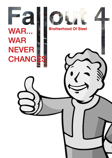
We then looked at composition and text editing. This involved placing an image into the title, in this case the fallout 4 title, using the same image I had previously bitmap edited. This title had also certain letter elongated in illustrator giving a unique impression to the page. For good measure I added the pip-boy mascot for the fallout games onto the page. 


Afterwards I used the same pip-boy mascot and place him into a bulk place holder writing text. However by clicking the image surrounded by text icon at the top of the program, this enabled the icon to influence the text placement. I place him many times to see the overall effect this button had on the page. I am not a fan of this feature as I like to have my layouts clean and divined.


While focusing on text placement we was show the how to make text follow a particular path, this was done by firstly creating a path pattern using the pen tool and increasing the stork of the line. I then inserted text on the line, creating its path. I thought that this was a useful tool in creating unique page layouts, adding some creative flare to a magazine page.

To better understand composition we was show how to add rulers and grid guides, it was said that it is best to divide a page by using 12 likes, this is because it has the a good amount of divisible lines allowing for almost any paragraph with. We then created three paragraph each at three bars wide and make each paragraph varied lengths.This was show to us so that we could understand how to make standard text look more appealing, within a layout.


The final thing I was shown was how to use layer effects in indesign, this feature is also in photoshop but I didn't know how to apply this with this program. This was accessed through by opening the effects window and using the drop down menu to create certain layer effects over a background image. This image was created by creating an orange back and applying the multiply effect on top of it.


Overall this this was a very enlightening tutorial as I now understood how to make images look more creative in indesign rather than needing to depend on photoshop to do simple tasks. Increasing my potential production speed during projects. 

Practical Drawing Interior Space

This week our practical drawing class with john consisted of interior drawing. This was the complete opposite of my last lesson with john, as we focused on wide open spaces. This week was about understanding interior environments, focusing on perspective. I wasn't very good at this, however I used a basic line style of drawing, using different coloured sharpies for each scene. I wanted to explore the idea of looking outside from an interior, giving a much more enclose feeling but having a glimpse of freedom.

This area was a drawing for the perspective of the practical studio area where we have many of our group tutorials on a Friday. With the late windows I began to use them like a natural frame, focusing my detail within the my makeshift canvas. From my perspective I could only see the roofs, so I was limited to what I could draw, and I didn't want to focus on my interior surroundings.


This quick sketch focused on little areas of inside objects, and had quite an abstract theme.


Overall I am not very happy with the outcomes of this drawing session and I would like to get better in future so that I can better integrate drawing into my graphic design studies, as I see it as a useful skill to have for the foundation of ideas.

Creative Cloud Suite: Josef Muller Brockmann In Design Poster Reconstruction

This purpose of this session is to reproduce Josef Muller Brockmanns most iconic international design movement posters. This was done to introduce those who have not had much experience with in design before, so that they can get acquainted with the software. I have had much experience in the past with this software so I found the session rather easy and not quite difficult. However as I have been looking at Brockmann for my sense of place project, I found that this was a welcome introduction to generating this particular design movement.


Although the idea of this was to reproduce these posters, I decided that I would change a few elements to make them more personal and distinguishable from Brockmann's originals. I did this by changing the original font and some minor colour changes for backgrounds. I think that this was a good choice to make, as it allowed me to experiment with colour and text.


Practical Drawing: Object Drawing

This practical drawing session with john was about improving our skills of drawing and understand drawing with perspective. The task which was set for this was object drawing. We were set given a number of scenarios where objects were displayed together, and we had to draw the objects from our current perspective. I found this task quite hard as I know that I am not a particularly good drawer and struggle with gather a correct perspective. However I attempted at capturing what I saw in-front of me. I decided that I would go along with any mistakes that I made and draw in fine liner as I would quickly shade any darker areas of my drawing. I think that this turned out okay, but I understand that I need to improve.


So that I could improve I started drawing some objects with pencil and setup my own little display with a meal deal I purchased at the student union. I wanted to focus on getting the outline right to begin with, so I began sketching my displayed objects. Overall I thought that I had a nice perspective but struggled getting some detail within my drawing.


Photograph Of Object Drawing Scene (Meal Set)

With my next sketch I began to focus on one particular object, a can, looking at understanding detail. I picked a can as it was a easy shape to draw and I could better concentrate on the detail with some shading. I decided to focus on the top of the can as that was the easiest with detail.


Photograph Of Object Drawing Scene (Can)

Overall I thought that this weeks object drawing task was very difficult for myself to understand perspective in drawing. Though that I believe that the outcomes were not completed very well, I do understand my strengths and weakness much better about myself. I will hope to improve my drawing skills thought the year, and use my strengths to my advantage.

Motion Graphics: Season Finale "Fish"

This was my final motion graphic process and production session with Sara. My final task was to produce a 10 second animation of a sea creature, this would then be put together with the rest of the groups material as a collaborative showreel, showing off our work together. I decided that I would create a fish swimming in the ocean.

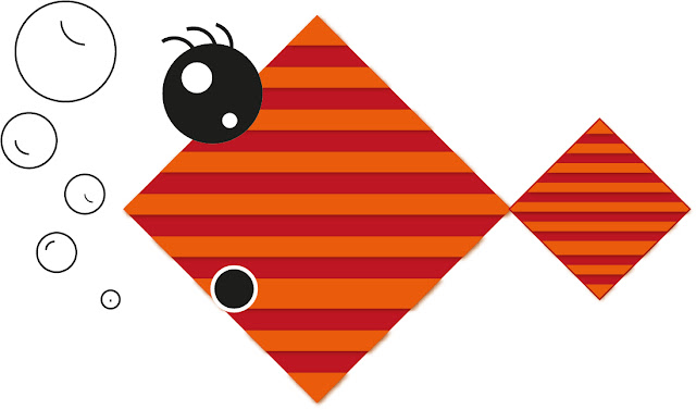
However I decided that the design of my fish would be rather graphic and geometric, having a different aesthetic to other sea creatures other people in the group would make. This allowed my design to be simple, and would allow my fish to make slightly exaggerated movements. When designing the fish I wanted many features to be animated. such as the tail, eyes, mouth and bubbles, which would give the fish a more character. However, I needed to keep in mind that for myself to animate these areas I needed to put them on individual layers.


Once I was happy with the completion of my fish, I began animating him in after effects, creating all the movements. This process was quite easy and allowed myself to really take my time to polish the movements so that they did not look jumpy.


Fish Animated from Jordan Harnett on Vimeo.

Once I had created all the static individual movements for my fish, I then needed to create a movement pattern to span 10 seconds in length. I thought that by giving my character a detailed movement, I could express his personally though, by making him quite shy. The idea was have the fish move quickly from one side of the screen to another, having him pop out occasionally in the cameras view. To achieve this I also wanted to make the fish smaller and larger throughout the movement animation so that it would play with perspective and insinuate that the fish was moving closer and further away. With all these technical composition ideas into place I would hope that my fish displayed quite a frightened emotion and seem quite shy.


Fish Movement from Jordan Harnett on Vimeo.

After this we then exported our fish to Sara where she combined everyones fish in to a little show reel. To my surprise this worked really well, because I thought that they would be many inconstancies in everyones skill level, but this worked out to have a rustic charm to it.

Overall I am very happy with the outcome of my final fish finale, I think that the fish was of good quality, however looking back I do think that they could have been some aspects which could have been better, such as the background and the possibility of adding some sound effects and background music.

Approches To Research - Questions

The task I was set for this seminar session was to attempt to acquire information from a brief set of questions. These questions were then answered with a yes or no response and with this information,  I was suppose to acquire what the person was thinking of. This process was similar to the game 20 questions. However this process required myself to write down questions first before I asked someone the set of questions. This made calculating the answer much harder as I couldn't change my course of thinking while I asked the questions.

Here are the set of questions I asked.

Is it something you eat? NO
Is it a person? NO
Is it someone famous? NO
Is it something you use? YES
Is it something that requires power? YES
Can you communicate with it? YES
Do you use it often? YES
Do you have it with you now? YES
Is it expensive? YES
Is it well known? YES

With these set of questions I tried to best fill all potential outcomes by asking a range of varied questions. Unfortunately even with multipul answers suggesting that the item in question was a mobile phone, the item they was thinking of was a computer. This had shown me that even the most obvious answer can have endless possibilities.

We then started the activity again but this time we were able to think on the spot of questions, with this restriction lifted I felt much more confident about guessing the final outcome.

Is it an inanimate object? YES
Can you eat it? NO
Is it decorative? NO
Can you play with it? YES
Does it require power? YES
Is it expensive? YES
Can you play games on it? YES
Is it made by Microsoft? NO
Is it made by Sony? YES
Is It the latest model? YES

This time I was much more successful in achieving my goal, I managed to guess that the answer was a Playstation 4. The point of this was to solidify the idea of understanding my research approach, becoming much more flexible in the way I work but also not be afraid of changing research patterns if the current one isn't gathering the right kind of information I am after.

Prequel Sequel

The focus of this lecture was around the themes of prequel and sequel. I have heard this term used within the film industry but not very much with design so I was interested to what context it would be relevant. The theory for this lecture was that nothing is truly an original concept, but you can still can design something with originality. With our sense of place project took into consideration it was explained that my exploration of the previous project based of a word, allowed for a range of approaches to design to take form. The time we had to explore possibilities with a lengthy research period allowed for myself to find inspiration from others and form my own development from that concept. While unlike the second project Visualization of Sound, we had little time to research are was therefore forced into designing quickly, coming up with our own ideas.

"Those who do not want to imitate anything, produce nothing." - Salvador Dali

The point was made that graphic designers and animators have the same intentions to communicate a message, but when we seek to communicate we rely on predetermined assumptions to provide context to our purpose. What I understood from this was that everyone perceives a concept differently to one another, and this also applies to design as well, remixing our understanding.


The lecture then discussed these main areas of focus.

Connection


In relation to the sequel and prequel mentioned at the start of the lecture, they were explain to have have many different meanings all of which focus on connection.

Intent


Intent is the purpose of connection. This gives an idea of how in which to communicate in order to successfully connect with an audience.

Tipping Point


The Law Of The Few: Which is the idea that in any situation roughly 80 percent of the work will be done by 20 percent of the participants.

The Sickness Factor: The specific content of a message that renders its impact memorable.

The Power Of Content: Human Behaviour is sensitive to and strongly influenced by its environment.

Nostalgia


A trigger towards both positive and negative emotion, providing emotive connection to an audience.

Continuity


The consistency of a product, for example films that have unanswered questions are deemed to have plotholes, which are relevant missing pieces of information not explained in the story. This is not to be confused by ambiguous ending.

Standard Elements


Combining existing components producing appropriated, transformed and subverted outcomes from the original source.

Movements


The evolution of ideas providing the foundation of future concepts.


Overall this lecture enlightened me about how good design requires good communication and intent. It shows how many different factors can affect design such as nostalgia and continuity, and how can ruin or enhance experiences through communication.

Convergence Seminar

What is convergence?

- Bringing a range of objects together to create a new formation.

- To forcibly blend multiple forms together to produce something new.

What convergence means to me:

 "To generate a hybrid, from using a range of different ideas"

In relation to the word convergence, the group was set a task to mimic a visual representation of the process of convergence. For instance, the task required myself to separate some pieces of newspaper and then after repurpose them by rearranging the pieces into a completely new form.

I produced some collages using pieces of newspaper and overlaying them at different amounts and angles to produce a convergence of material. I thought that a collage was a great representation of convergence as it expressed the process quite well, though it wasn't the most visually appealing work created, I think that by doing this process that it allowed me to fully understand what I had to do for my sense of place project. 


I did the same process with this design, however, I used red card rather than black to see what effect it had. Overall I prefer the black collages.


I created three pieces for this seminars convergence theme, the third piece was created afterwards using my photographs I acquired at the Yorkshire sculpture park, and integrating my own creative material.


Though this is a simplistic concept, made popular by writer William Burroughs, it helps provide visual solidification of the meaning of convergence, and with this process I have found it easier to understand what to research and produce in relation to this weeks theme.

Design And Emotion (Seminar)

In relation to the previous lecture we had on design and emotion. I was set the task of creating a visual transformation from one word to another in the process of nine stages, similar to a storyboard. This was to show the transformation between two stages, for instance happy and sad. This process would be show through illustrations or text. I decide that I would create a timeline crossing the seasons, spanning across two years. This is because I wanted to explore how I could slightly change the second season to give the message that somethings change while others stay the same. I was looking for a simple expression to create a strong emotive response, because I fins that design works rather well that way.

The simples forms of communication work best for me personally, and if a message is kept simple, I tend to find that it translates rather well. I decided that I would only include one type of colour for each season throughout the sequence, to enhance the simplicity of the design.

I thought that this seminar was quite relaxed and allowed for myself to better concentrate on producing a concept that would for the idea of design and emotion. I believe that the best design invokes a bittersweet sort of emotion.

Design And Emotion Lecture

For this lecture we began by being shown an photographic image and to express our current thoughts and emotions for what we could see. Collectively the group concluded that the image was of a under exposed photograph of a lamppost. For the emotive effect however, this created a generation of varied emotions towards the photograph speculating what the meaning behind the photograph could possibly be. I personally thought that the photographs was of a sinister looking nature, showing intense dominance due to the low angle shot. On the other side I tried to think of a more positive reason behind the photograph, this came to be with the expression of the light at the end of the tunnel, where the light symbolizes hope within the darkness.

This is done through a process called Sensory Information Processing.

We was then met by a series of illusions and perception challenges, the first being colour vision, where there were a range of dot patterns with some of the dots being a different colour to the background. This was to understand the effect colour blindness, and how colour can effect our perspective. We also looked at some of the more common illusion designs, where an overlaying pattern of colours consisted in a circle, created the effect of them moving in your peripheral vision, this was explain to be because of the, intensity of your brain capturing each colour simulating that they are moving when they are in fact not.

Something that caught my attention during the lecture was the way our perspective can be tricked into seeing something complete, when in reality it is not. Almost like a mirage. This is done because of the way in which our eyes process information, using pieces of data to construct for what we would commonly see as normal.


This has been shown by the upside down mouth on a photograph illusion phenomenon, where your brain is tricked into think that it is normal at first glance but isn't at all. However this was shown in the lecture through a You Tube video of a T-Rex, where when you position changes, the T-rex eyes keep following you. I was really impressed at how this was occurring and was trying to guess how this was happening. This eventually was revealed to be complex arrangement of mirrors design to reflect the T-rex, showing that our eyes can be easily fooled by great design.


https://www.youtube.com/watch?v=A4QcyW-qTUg&list=LLaJu6gGe3ieAEdT8PfprfOA&index=44

Perception = We Override Our Own Reality = How we Interpretate information

It was quoted in the lecture that "We Expect What We Expect To See", meaning that when our brain is met with some foreign information, it try's to normalise the situation, by processing what we perceive to be normal.

Example of this are show through: 

Inkblots

The Exceptions Effect

Priming

Depth Perception

Overall I found that this lecture opened my eyes to how we underestimate our mind, and sometimes to not fully question if what we are seeing is truly what we are seeing. I felt like this lecture was more about psychology, but the idea of design is to produce visual material for that which creates a certain emotion, and I think that I understand more about how to create emotion though design.

Message And Meaning

This lecture about message and meaning was to help understand what complications occur when communicating a message and how it maybe perceived by others. The sound of this lecture produced a common intrigue with myself and other students, as we are upcoming designers, and knowing more information about this would be very beneficial to our studies.

"The Difference between poetry and practical messages is that the latter are successfully only when we correctly infer the intention" Michael Rock

Message and meaning at base value seem like common knowlage and understanding, however when it comes to designing it is crucial that designers consider all the possibilities of reactions that can come from that piece of work. If not this can lead to miscommunication and can invoke a hugely negative or controversial responses from an positive intended product. This in my opinion has got much worse with the introduction of social media where opinions can gain influence with popularity and can completely generate a meaning from something which isn't present. This happens through standard communication through social interaction through digital means such as texting, where others can become offended though poor expression. With this in consideration I began to understand the pressure designs have constantly in the industry. 

Due to the fear of negative outcomes, it was expressed during the lecture that graphic designers and animators should constantly keep reviewing the message which can be interpreted no matter how small it could be.

What is Message?


"A short communication transmitted by words, signals or other means from one person, station or group to another."

What is Meaning?


"Meaning is what the source or sender expresses, communicates , or conveys in their message to the observer or receiver, and what the receiver infers from the current context."

We was shown an image of the process and how the communication transfers from the designer to the audience. This seemed to be an infinite process as perfection of message and communication seems rather unlikely in a consistently developing world, where morals, opinions and understandings change. 


Send/Encode: Represents the information translated into a message in the form of ideas or concepts.

Channel/Medium: Represents the Process in which the sender uses to communicate the message

Receive/Decode: Represents the way information is received through the channel.


Convergence Lecture

As part of my sense of place project the word 'convergence' is the key topic which myself and fellow students are basing our research and designs around for the Concertina Sketchbook. The purpose of this lecture was to further my understanding of the word convergence and how that it applies to my study of design. My current understanding at the time of this lecture was that convergence and how it applied to design, was a cross combination of separate ideas forming  together generating a new concept.

"Convergence is an ambiguous term used by various disciplines to describe and analyse processes of change towards uniformity or union. Its application in the communications sector often referred to as media convergence also encompasses valuable approaches and insights to describe, characteristics and understand the digital creative economy" - Media Convergence Michael Latzer / Quote from the lecture slideshow.

Uniformity definition: Google Definition

1 A state or condition in which everything is regular, homogeneous or unvarying.

2 Lack of diversity or variation, especially to the point of boredom or monotony; sameness.

Union definition: Google Definition

1 The action of joining together or the fact of being joined together, especially in political context.

2 A society or association formed by the people with a common intreat or purpose.

However from the first few slides of the presentation I knew that the word convergence would be something that was of huge importance to the theory of design, as design is a subjective practice and is heavily debated, the topic of convergence would be an interesting idea to explore.

Other Words For Converge:

Multidiscipline - Interdiscipline - Crossdiscipline - Synergy - Intergrated - Hybrid

The lecture consisted of a set of opening quotations of opinions on the overall idea of how convergence applies to design. Following the quotations our lector additionally showed designs of varying styles and medias. For instance I personally liked the exploration of logo designs, keeping in mind the word convergence, I saw the designs in a completely new perspective.


Screenshot taken of the logo's shown within the lecture

For example the Kleenex logo at first glance appears like a standard font based logo, however with the word convergence in mind, I started to see the relation to the word through the way in which the letters were conjoined. This small aspect proved to me that convergence isn't just about overlaying different design practices and experimenting with gradients. It made a statement to myself that it is more about the subtleness of design, understanding the sometime less is more.

Wednesday, 20 April 2016

Practical Drawing: Typography Week 3

The task this week was to produce a finalised version of my chosen typeface. I decided that I wanted to proceed with the creation version of my 5 by 4 square grid typeface. This typeface would also be an experiment which I would include in my EU referendum engagement project.

Finished Alphabet Layout Of Chosen Type


Illustrator Converted Type Vector Design


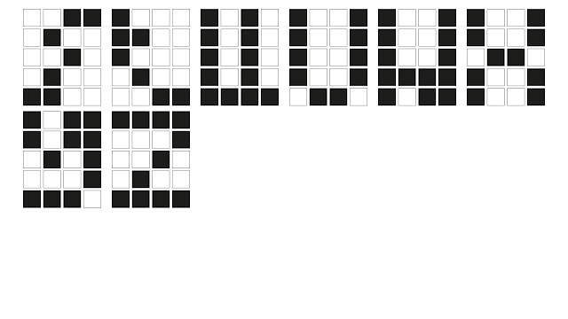
To better apply my typeface in a more digital way, I decided that I would create a vector based version of my physically created type. With the ability to create cleaner lines and colour I created each type out of a 4 by 5 group of boxes. These boxes would have the letter filled with a black box, while any negative would be a white box, with a slight stoke around the edge. This helped myself visualise the idea digitally. I also thought that this allowed the type to keep to a constant formation when being used to display words.

I think that these typography workshops have been very beneficial to my development as a graphic design, I now think much differently about how type is generated and  have gained valuable experience in the construction of my own typeface. With these skills developed I can hopefully explore a typeface generation project in the future.

Practical Drawing: Typography Week 2

This was the second task of my process and production lesson, the purpose of this task was to construct 3 complete alphabets forms. I have completed three styles of alphabets, each using a particular method of producing a particular shape. However all of these typefaces are being constructed under the theme of compression.

This alphabet is focusing on using shapes to cut out of a square block to produce a an identifiable letter form. This alphabet is mostly using triangles to form negative space for the shapes. This is a really nice and unique looking typeface, however for letters like the G, O and P the letters a much harder to read, this is an obvious complication as a good typeface can be read easily.

Square Box Cutout Typeface


I personally really like the way in-which this typeface formed, giving the impression of digitalisation and almost like a retro themed design. This type of design had a unique form of structure due myself limiting the area of space which I could work with. During the creation of this typeface, I understood how good typefaces require good transition from one letter to another, as it this makes the typeface much easier to read in a sentence or when words are constructed.

5 by 4 Square Limited Ratio Typeface


This typeface focused on compressing the size of letters. Making them look much thinner and removing any curves. This would give the type a particular shape edged look. I also thought about completely filling the lines but I thought that the the way in-which you see the construvtive shapes and lines added to the overall character of the typeface.

Reduced Letter Size Typeface


Overall I am very happy with my three created alphabet typefaces, I will also look forward to producing one of these typefaces further seeing how I can improve and refine the overall design. 

Practical Drawing: Typography Week 1

This weeks practical drawing process and production session focused on the generation of physically produced typography. We was told that this would span across the rest of out process and production workshops, focusing on a different task each week. This week my task was to transcribe shapes into letter forms, either upper or lower case. I began by joining shapes together using a curved edge and in separate parts, this was so that I could understand the construction of the shape, knowing where each part of the text formed. The letter this created was a J and looked somewhat mechanical, like the binding bridge between the wheels on a old steam train. With this in mind I created a few other shapes that used the same process.

I then wanted to explore using simple geometric shapes to explore how together they could create a letter. At this point I wasn't to bother about lower and upper case letter, my main priority was to understand how letter forms constructed. I used a group of circles to produce the letter I. However, I didn't think that these circles should join as this would be to predicable. However this created the complication that the letter I would look much different that its intended form. I decided that to help produce the idea of the letter eye, I would then with the traditional head of a lowercase eye, add some other circles to resemble a pupil and iris, giving a more visual representative of the letter eye. This can also be seen with Dingbat letter forms. 


An Example Of Dingbat Letter Forms


I then looked at producing a few more compressed letter form, forming shapes within a boundary or touching each other. For example the letter S would commonly be much taller on a standard font, however I shortened this letter by removing unnecessary parts of the letter, but retaining its iconic state. I understood that this was a very relevant factor to creating a good typeface.


I then began to produce an alphabet series based on my compressed typeface idea. I decided that I would go with a restriction 5 by 4 squares, to fit with the theme. Overall I am very happy with the outcome of this typeface as it gives a really nice introduction to this process and production typography series.